Auditorium and Library, Staefa, 2005-2010
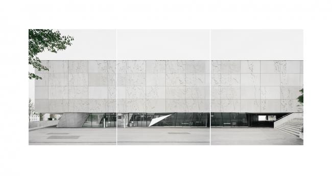
This writer has often asked himself the question, what would be the typical image of Zurich? Often, people who do not know Zurich are shown a panorama in which they see the city from an elevated perspective, in the afternoon, with the industrial zone and the historic city center in the foreground, lake in the middle of the scene, and the Alps, illusively near, in the background. However, if it were about summarizing Zurich in the totality of a single image – such as in the first chapter of Gottfried Keller’s Green Henry – then the aforementioned image must be reversed in time and space, and the city seen as a uniform, shimmering nocturnal sea of light around the black of the lake. Zurich stretches far along the lake itself, so far that the lights of the dense development are lost in the distance. Here, something resonates with a city that would also like to be Los Angeles, but remains trapped within the narrow chamber of its landscape.
The development that characterizes this author’s internalized image stretches, without interruption, along the entirety of Lake Zurich. One of the communities on its upper end is Staefa. The “Riviera” there is rural-Mediterranean, a product of placid wealth and righteousness. Further away from the lake, up the slight slope of the hill, development appears much less compact, typical of the Swiss Midlands, but remains dense enough that one can speak of a continuous and well-ordered residential structure. Then, between single family homes and old village centers, lie blocks of flats from the 1960s, clear and firmly sliced volumes above garages, some set atop piloti. One stands before subsidized housing, dreary, as one expects. Precisely here, adjacent to the school grounds, is where E2A Architects planned a community center and music hall with a library.
The new construction supplements an ensemble of buildings from the early 1970s which previously had been expanded to include a gymnasium complex.
The addition – a playfully volumetric building clad with cement tiles – is not capable of whitewashing the dreariness from the area. The task of the architects was to provide the existing school and district with a sense of place and center, and the community a political-cultural focus – though far removed from the traditional village center.
Brutalism Today
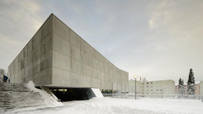
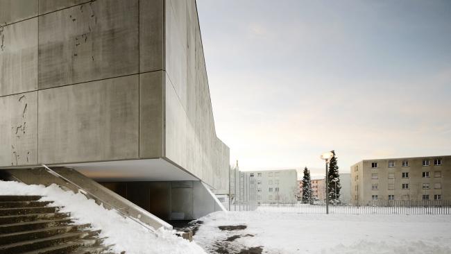
The heavy and massive body of the new construction soars over a plinth, which grows out of the existing building complex. Since the first expansion as a terrace, this platform has existed as a part of the playground and houses workshops and music rooms, half sunken into the earth. This programmatic element was to be retained, and led to the concept of the competition project as a building, statically penetrating the platform below only in isolated locations.
Such a solution, so concentrated on the static absorption, is in and of itself monumental. The monumentality was further exaggerated by the architects through their formal development of the load-bearing objects, which touch the ground only at a few selected points.
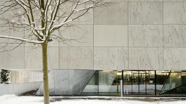
The coarsely-grained surface of the bulky concrete block, articulated through a light network of joints, strengthens the severity of the inhospitable rear side of the existing housing block. The new ensemble reminds the observer of a building style as one is familiar with from the former Soviet Bloc countries – a socialist Realism together with a relief-style art of representation, which strongly contrasts with the self-image of the middle-class dominated Gold Coast communities.


However, the implied hardness can be interpreted as a formal reaction to the immediate surroundings. Furthermore, in Staefa, compared to most buildings and complexes in 1970s socialist East Berlin, Prague, or Budapest, this building was set into its context, the spatial relationships were executed with Swiss precision, and – previously only allusively present – a new place was created. (This was also attempted in the East – however, interventions in developmental contexts remained far too often prisoners of Modernist schematics.)
From the perspective of an architecture influenced by Modernism, aspects of the particular working methods of Piet and Wim Eckert, the founders of E2A, become interesting. In one study of the architecture of Mies van der Rohe – which they entitled “Miesology”, – they analyzed his buildings in the context of their generalizable formal shapes, and, by means of serial montages in a so-called distillation process, retained what remains relevant for the everyday since the popularization of Modernism (and can be evaluated today.) The experience is comparable to the interest that Allison and Peter Smithson brought to the work of Mies. In their book Without Rhetoric, they describe Mies’ building from the back side, so to say, by showing images that have a completely non-heroic effect: facets of Miesian architecture suitable to the contemporary everyday life.
But wherein lies the specific-to-Mies adaption of Modernism in the delineated project?
Both Le Corbusier (Une maison – un palais) and Mies van der Rohe sought a modern formula for monumentality – without losing sight of the fact that the monumental in and of itself can be neither an architectural quality nor a rule for all architecture. Mies himself recognized that public architecture must be monumental compared to vernacular architecture, in order to serve as the expression of a community and its own epoch. This is particularly clear on all levels in the New National Gallery through an emphasis on the tectonic, in which the architectural organization is reduced to primary elements – plinth, pillars, and roof. The elevation of the roof alone was a monumental act. Slightly more than 40 years after the opening of the New National Gallery – to return the train of thought to Lake Zurich – Mies’ monumentality applies to the accentuation of the incidental and material expression of the Smithsons; the pure architectonic form is docked into the existing structure and morphed.
Monumentality in Staefa can be described more precisely with the words of Peter Meyer – whose sole notable built work was erected on the opposing side of the lake in Thalwil, on the property of Lindt & Sprüngli. In a 1938 essay that appeared in the journal werk, Meyer demands with Zwinglian manners that a clear boundary be set between profane and monumental tasks.1 However, he also shows that monumentality is always linked with pathos and “quasi-sacredness” – with this, the two most important qualities of the building presented here are recognized, Zurich style.
Urbanity in the Village
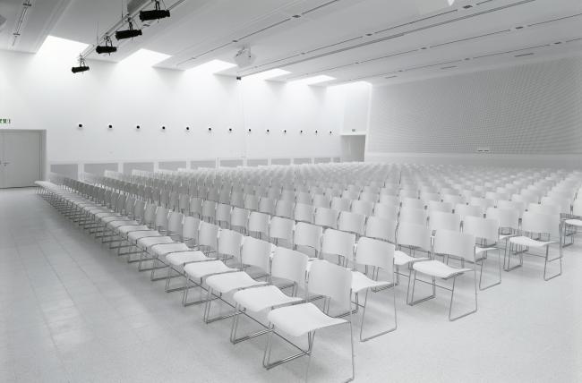
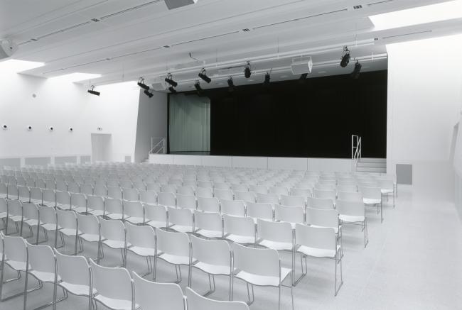
“Quasi-sacredness” prevails in the interior of the new community hall even in the front foyer, which is lit merely by a skylight. The red-tinted poured asphalt, white interior walls, and the coarse surface of the exposed concrete exterior walls create an atmosphere that would do credit to a parish center. Inside the hall, the sacred effect swells to the realm of film: baptized completely in white – even the furniture is this color – the room becomes an enactment of Kubrickian proportions, comparable to 2001: A Space Odyssey.
In this staged setting a political convention involving the down-to-earth leaders of the Swiss People’s Party would seem rather comical!
The highly orchestrated architectural media disguise the fact that the building must obey a nearly uncontrollable variety of user demands. It forms an organizational link – or a keystone - not only in the exterior spatial configuration, but between the different elements of the school complex; it is utilized by the school and by the visitors to the community library, as well as various clubs and, naturally, by the community itself.

Through a clever combination of entrances and foyers as well as shifting ascents and descents, it is functionally possible to use the building for different purposes simultaneously – all of these, however, are obscured by the forcible language of the architecture.
The functional fulfillment of the program and the monumental gesture of the elevation offers the concept of a suspended auditorium with particular urban and civic qualities that the floor-mounted neighboring buildings do not possess: as playground with niches, as promenade, as window to the library and the basement rehearsal rooms, as reading terrace. At night, the platform between the glass and metal prisms becomes a well-lit stage, which provides a certain glamor for the normal, everyday life of the community and the gray surroundings. The massive building above is perhaps merely noticed as a shadow, as a natural landscape element. If Peter Meyer, in his 1938 essay “Thoughts on the Problem of Monumentality,” denounces “colossal hand rails,” “lighting curiosities” and “conspicuous materials which make more metaphorical noise in their ‘simplicity’ and ‘chasteness’ than any form of ornament,” in this negation he shows how monumentality can be achieved within the Zurich arena: namely, in the intensified expression of what the architecture already conveys.2 Here, the lower basin of Lake Zurich again comes into view in connection with the National Exhibition of 1939, an event that strongly characterized the spirit and architecture of Zurich and of Switzerland. Architects such as the young Haefeli Moser Steiger, Hans Hoffmann, and Karl Egender attempted to delineate a formal vocabulary into a specifically Swiss “non-monumental” monumentality. In this exhibition, the industrial and rural sides of Switzerland form their own individual worlds on opposing sides of the lake, a sort of complementarily composed, pathetic image; in the middle stretches the mental landscape from days past. Here, the actual sense of the word “monumental” appears, as “monere” means “to remember.” This is the case today in Staefa, where the textured concrete surface serves as a reminder of the economic success of Switzerland due to concrete and simultaneously refers to the bark of fruit trees - to those trees that lend the school campus its name, that have existed on the banks of Lake Zurich for less than three generations, as the architecture of Modernism was being born, and that characterize the landscape.
2 ibid. In his essay, Peter Meyer advocated the implementation of ornament and classic monumental forms with the goal of achieving monumentality. The development of Swiss modern architecture, however, developed unambiguously in the criticized direction.
Text translated from Tibor Joanelly, “2011 - a mies odyssey,” in werk, bauen + wohnen, No. 6, June 11, 22-29.
© All rights reserved. Werk Verlag AG, Zurich. Made available by the Werk Verlag AG, Zurich.


Auditorium and Library, Staefa, 2005-2010
Tränkebachstrasse 39
8712 Staefa
Schweiz
Structural Engineer: Walt + Galmarini AG, Zurich
Façade Engineer: Feroplan Engineering AG, Zurich
Mechanical: Todt Gmür + Partner AG, Zurich
Landscape Architecture: Vetsch Nipkow Partner AG, Zurich
Artistic Collaboration: Hans-Peter Kistler, Beinwil
Photographs: Radek Brunecky, Zurich; Rasmus Norlander, Zurich; Hagen Stier, Hamburg; Jon Naiman, Biel (Model)